Ancal7
Madrid, 2024
Client: Ancal7
Location: Madrid, Spain
Online e-commerce shop
At Wattnem & CO, we recently had the pleasure of working with Ancal, a dynamic ecommerce company specializing in a wide range of essential home products, including pet supplies, lighting solutions, furniture, and daily-use gadgets. Ancal approached us with a desire to revamp their brand identity, seeking a modern, digital adaptation of their existing logotype, which had begun to feel outdated.
Overview
The Challange
Ancal, a startup specializing in essential home products, approached Wattnem & CO to modernize their outdated logotype. They sought a fresh, digital-friendly brand identity that reflected their diverse product range, including pet supplies, lighting solutions, furniture, and daily-use gadgets. The challenge was to create a contemporary design that captured Ancal's commitment to quality and convenience.
Our Approach
We began by understanding Ancal's brand values and customer expectations through market research and competitive analysis. Collaborating closely with Ancal, we aimed to ensure the new branding resonated with their target audience. Our design process focused on creating a visually appealing and adaptable logotype, incorporating feedback at every stage to achieve a final design that reflected Ancal's ethos.
Experience Branding
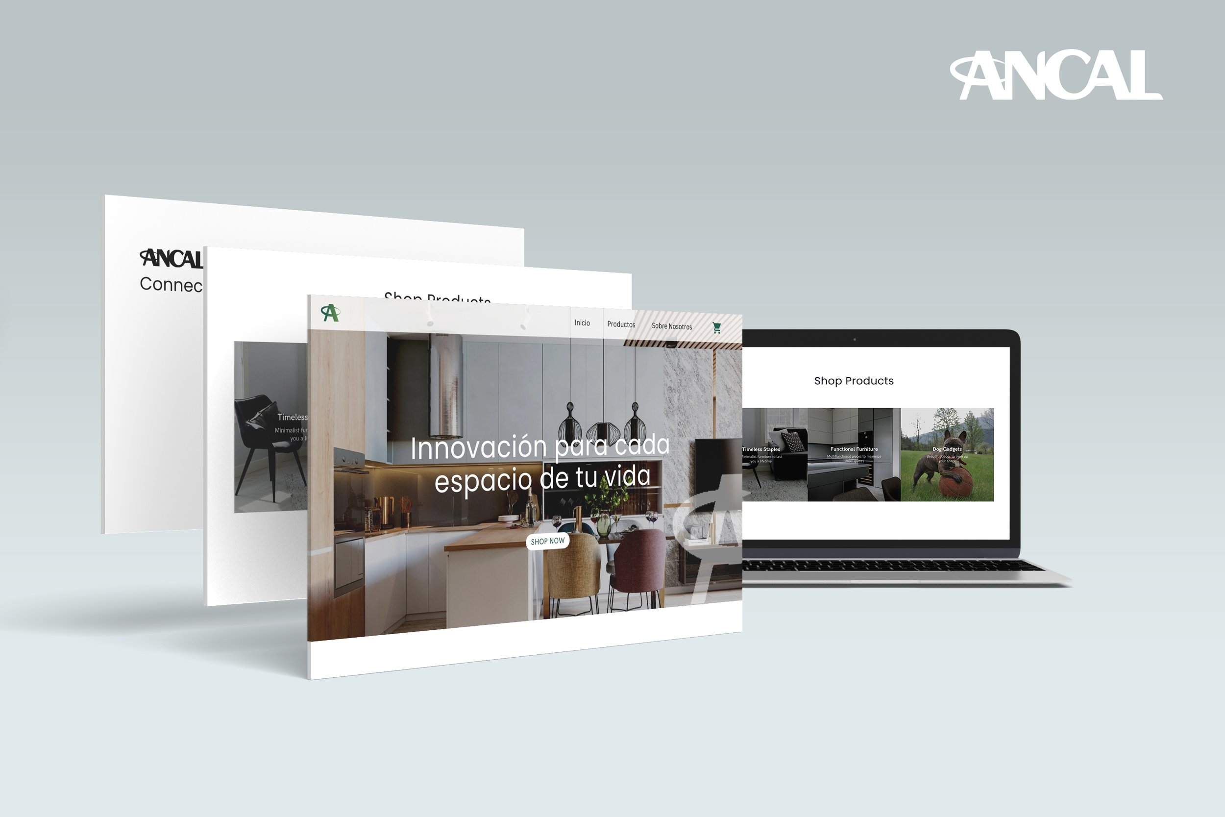
The rebranding experience for Ancal was transformative. Wattnem & CO crafted a sleek, modern logotype that encapsulates the brand's forward-thinking approach and diverse product offerings. Our storytelling approach ensured the rebranding was a comprehensive enhancement of the brand's narrative. The cohesive visual language and strategic design elements we developed now help Ancal stand out in the competitive ecommerce market, creating a compelling brand experience that drives customer loyalty and growth.
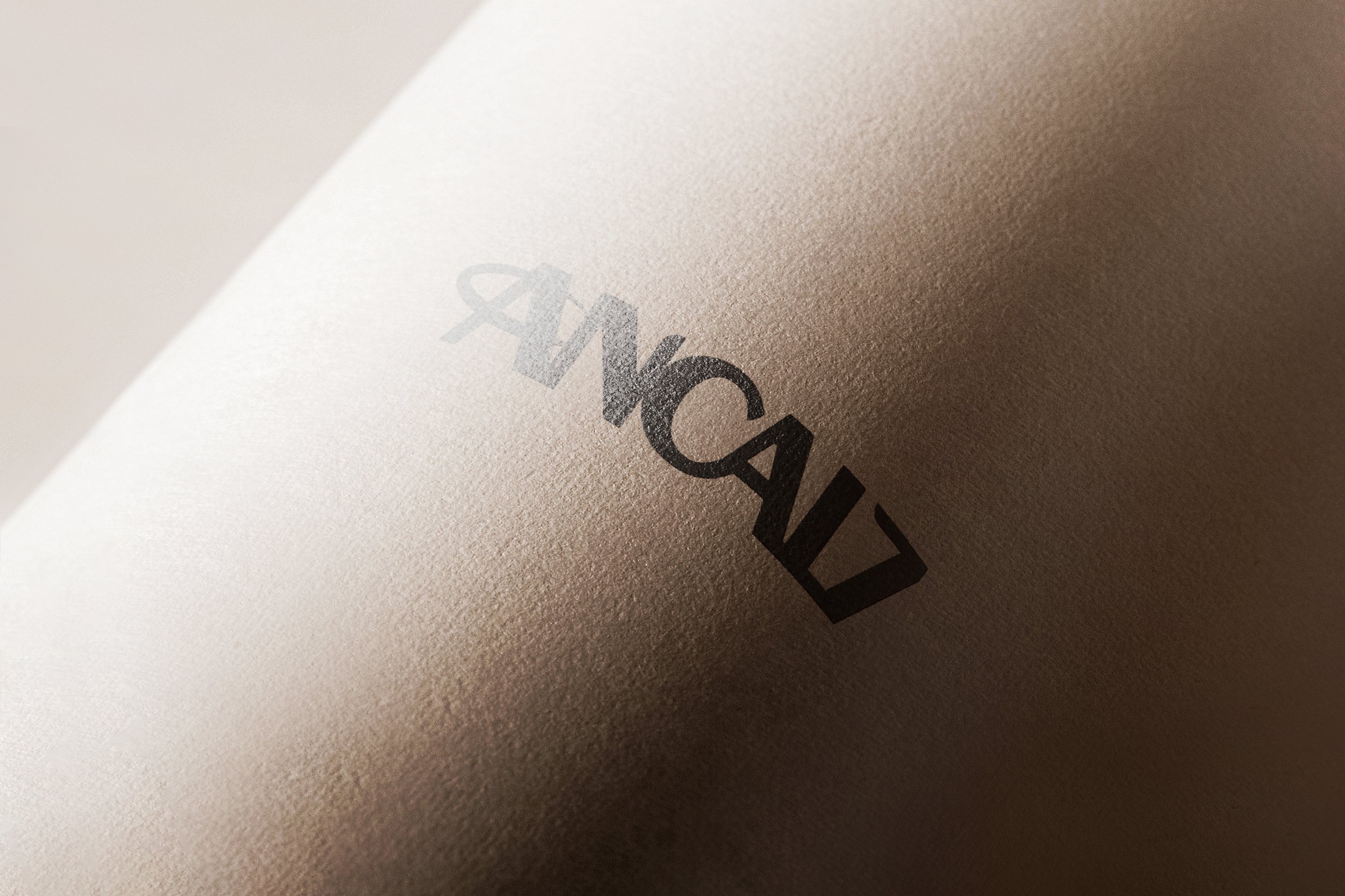
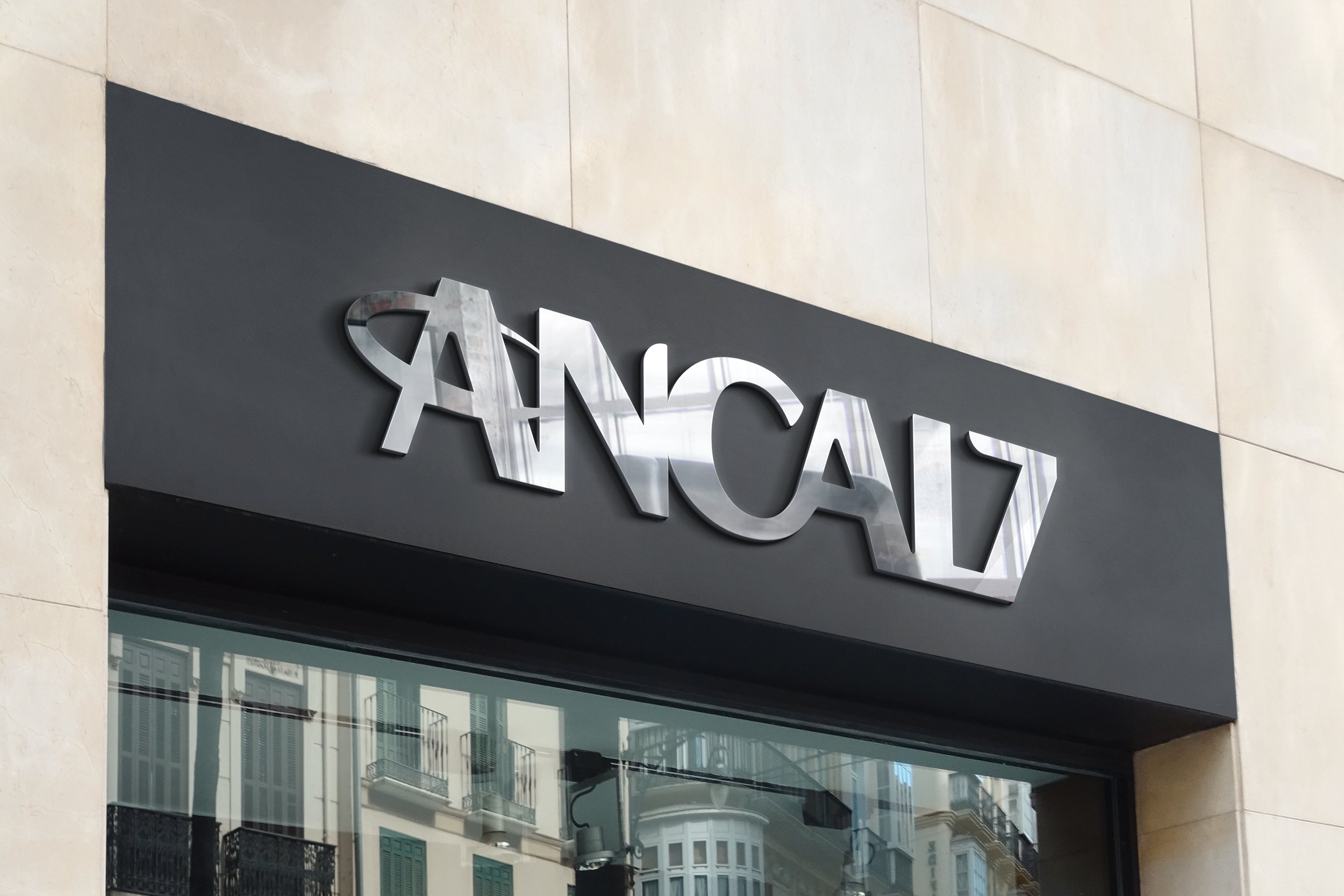
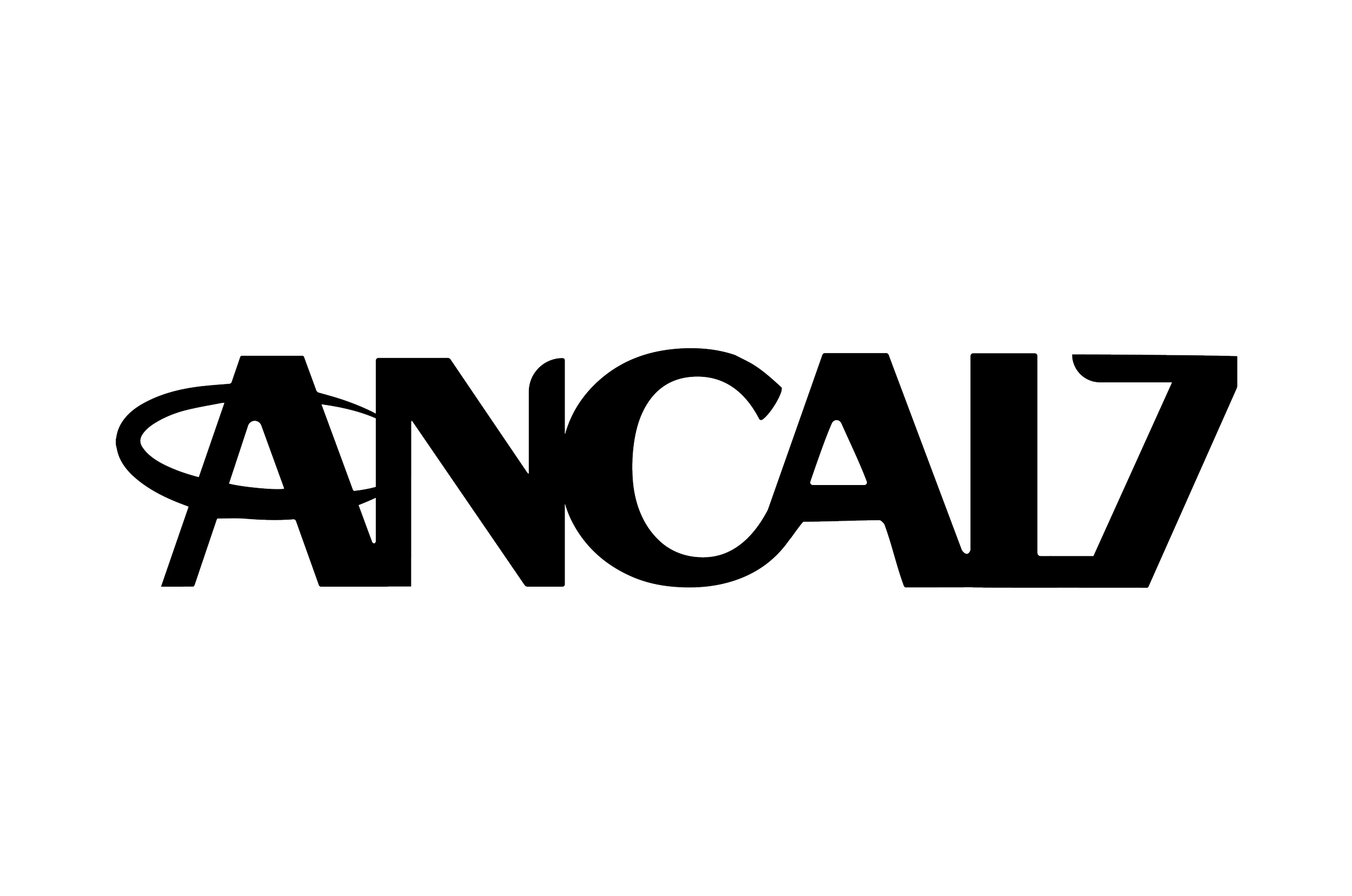
Our rebranding work involved creating a sleek, modern logotype that reflects Ancal's forward-thinking approach and diverse offerings.
Thoughtful Design Choices
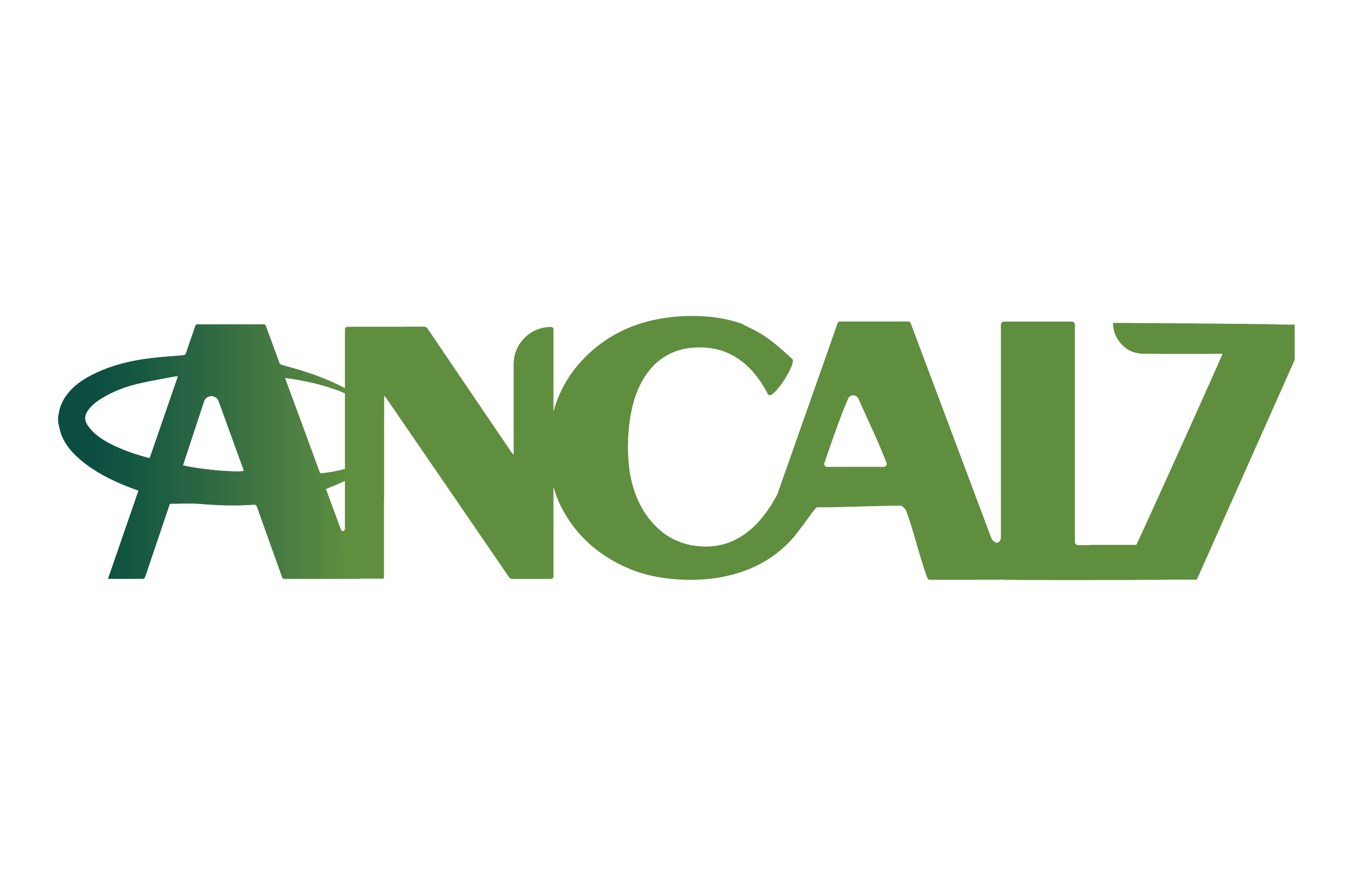
We selected a green gradient for the logo to symbolize growth, freshness, and reliability, aligning perfectly with Ancal’s commitment to quality and convenience in everyday home essentials. The green gradient evokes a sense of eco-friendliness and innovation, resonating with a broad, environmentally-conscious audience.
The "A" in the logo is encircled to represent unity and completeness, embodying Ancal’s all-encompassing range of products. This circular design element also signifies protection and assurance, highlighting Ancal's dedication to providing trustworthy and dependable home solutions.
Mariano Jarillo, Zona’s Co-founder.
“For anyone looking for exceptional design services with a personal touch, I can’t recommend W&CO enough. Their team genuinely invests in understanding our objectives and delivers remarkable creative solutions. We’re thankful for the strong partnership we’ve developed with them!”




![Ancal Logo [Recovered]-01.png](https://images.squarespace-cdn.com/content/v1/6668078e9c331844cda5e8cd/c46d7252-1b1c-4dd9-9e95-b8c3080fec3a/Ancal+Logo+%5BRecovered%5D-01.png)
